Thursday, 11 May 2017

Creative Journey - Entry 10

In this final entry to my creative journey, I will discuss:


  • Risk Assessment
  • Print Artefacts
  • Audience Feedback
  • Evaluation Questions
  • My Final Music Video
Risk Assessment

I created a risk assessment to ensure I was prepared for all possible eventualities, from minor to major risks. I created it to help prepare me for when I am filming, and also because it is part of the protocol you must undertake in the industry.

Print Artefacts

I created my print artefacts (CD digipak and a magazine advert) on PhotoShop, the industry standard software, to make them appear as professional as possible. I am extremely happy with them and have received lots of positive feedback from my peers.

Audience Feedback

Similar to my previous music video, I took it to my peers to get a non-biased opinion of my music video. I was glad to receive positive feedback in retrospect to my previous one. It was at this same point that I took my print artefacts to the class to get their opinions on them too which was positive as aforementioned.

Evaluation Questions

When producing my evaluation questions I used as many different technologies as possible to firmly fit the brief. Including Prezi, Sony Vegas, Photoshop, Blogger, Word, as well as peripheral items such as a studio microphone, headset etc.

Final Music Video

This post features my completed music video.

Wednesday, 25 January 2017

Evaluation Question 4. How did you use media technologies in the construction and research, planning and evaluation stages?


To document all of my coursework I used a website called Blogger. On this website I would publish every piece of coursework I had done in chronological order to make it easier to see my creative journey. As well as this, I learnt how to format html posts when embedding videos and prezi presentations. Blogger allowed me to go back to previous posts and edit them, topping them up with knowledge and work I didn't have previously. It also allowed me to save drafts, this meant that I could save a post without publishing it, it also allowed me to work on the same post both at school and at home.

Image result for blogger

One of the benefits of Blogger, as aforementioned, is the ability to embed things. Therefore I could add items such as pictures and videos to my posts to enhance them, it also makes it much clearer as to what i'm referring to in my posts as there are physical images. As well as this when researching existing music videos I could embed the physical video so it is easy to refer back to in the future as well as for the ease of anyone who reads the posts.

One of the media technologies I used to plan my project was an online mind map website called Bubbl.us. On this website I could create a clear digital mind map in a time efficient manner. I preferred to use this over hand drawing a mind map as it was quicker, and should I have made a mistake I could easily remove it instead of starting again. As well as this, it was easier for me to create a clear mind map due to the extra room on the page as well as being able to easily colour code it. I used this website for my second project after it proved successful for the first project.

Image result for bubbl.us google


Then, I created my storyboard on a website called Storyboard.me. Once again I found this website useful as it was quicker than hand drawing and looked a lot clearer. I did this to create a simple 12 panel storyboard using images that the website provided. However, for my second project I decided it was better for me to hand draw it rather than to use the website as I found that it was limited in what I could add to my storyboard such as poses, props and locations. Hand drawing gave me more room for creativity and to convey my narrative better.

I then used word to create a risk assessment. I inserted a table to fill out my risk assessment on as it is easy to add more cells to it and it is more efficient than using another similar program such as Excel. The fact that I could use varying numbers of rows or columns allowed me to create the perfect table for my risk assessment, making room for the risks identified, a scoring system for a risks severity, measures to prevent the risk and how many people would be at risk.

To record my footage I used a DSLR camera as it gave me more freedom than a simple point and shoot camera. Using the DSLR I could change the ISO of the camera to make it easier when filming in darker or lighter areas. As well as this, the actual camera quality is better than the average point and shoot camera. I believe using a DSLR is also better practice for the future and it teaches me more about the equipment modern media is produced with.

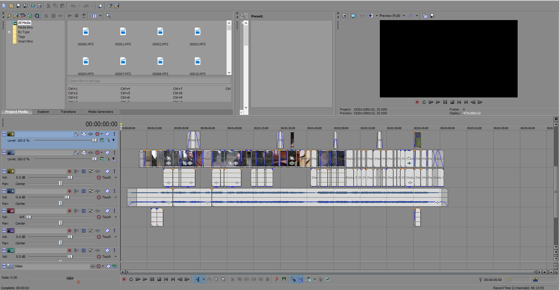
To edit I used a program called Sony Vegas. I used Sony Vegas as compared to it's main competitor (Premiere Pro) as I prefer it. I find it simpler and easier to use because of it's layout and minimalistic appearance. On Sony Vegas I created a new project file, added my footage, cut it into the correct sequence and then edited it, such as colour correction. As well as this I created my title sequence on it with ease, using a 'Gaussian blur' filter over the footage behind it. To add the titles i had to create a new video track, then add text. I could then edit the text changing the wording, font and size on the menu that opens. As well as this, I could then move the text by changing its coordinates to make it sure it was precisely were I wanted it. To add the Gaussian blur i had to right click the footage, then click 'add video fx'. This opened another menu where I had a range of effects to choose from and I chose Gaussian Blur. I added the footage and then edited the timing so the blur slowly goes away in time with the titles.

Importing files into Sony Vegas was very simple, you simpy clicked 'file', then 'import' which would open up your computers file directory. Once on this screen you could then browse your computer to find the files you wished to import. On my PC it was under my Local Drive (D:) which is where I saved all my footage. To get the footage onto the computer itself I had to take the memory card out of the camera, then put into an SD to USB converter, it would then show up like a USB flash drive on my PC. From there I could transfer the files over to one of my internal hard drives.

When creating my ancillary texts, I used Photoshop to first create a template for my digipak. This way I could then open my images and put them on top of the 36cm x 24cm template i'd previously made. I chose these dimensions as each panel would be 12cm x 12cm, and I was creating a tri-fold digipak. Layering the images successfully over the top was easy, by reducing their opacity to 50% I could still see them as well as the template behind them. It allowed me to get the correct ratios for my images as well as leaving room for 'ink bleeding' like I'd have to do for a real digipak. I did this by creating 'guides' to create the areas that I could work in without the ink bleeding. The guides were visible lines that would not be on the printed product however. It also allows me to create artwork to go on the disk and behind where the disk is held. Photoshop also allowed me to edit my images accordingly, creating monochrome effects for most of the image whilst keeping certain parts in colour. I added barcodes, copyright text as well as a production company logo (Sumerian Records). I used adjustment layers to change the colour of some of my images to black and white to link in with the themes of the album and music video. I was comfortable with using Photoshop to develop professional looking results due to previous practice with the product, it was, in my opinion, the best software to use as it is the industry standard.
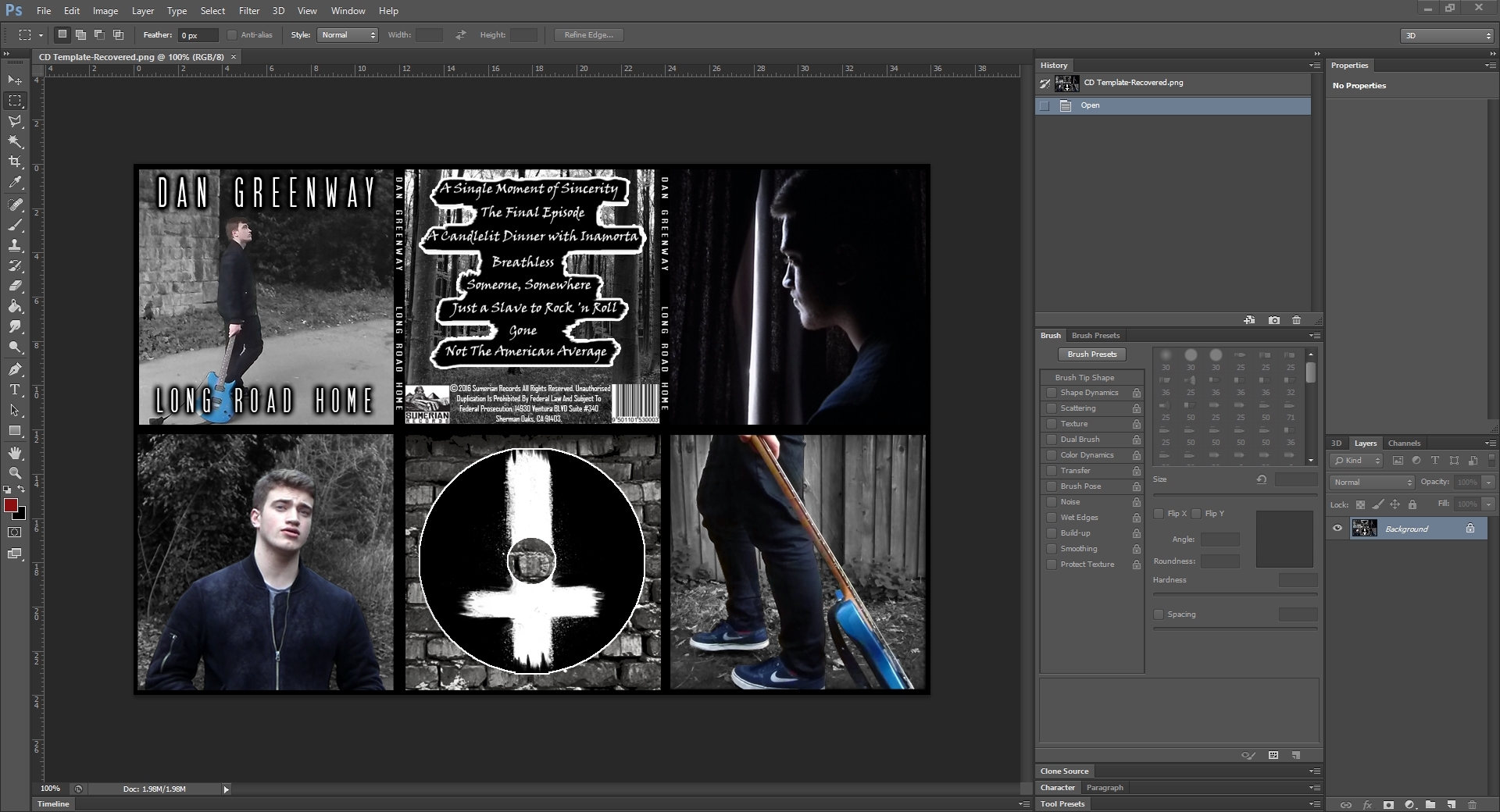


Image result for blue snowball

When doing my evaluation I used multiple technologies to make it as a appealing as possible. I used a presentation software called 'Prezi' as it is extremely simple to use as well as very easy on the eye with its transitions. For evaluation questions one and two I used Sony Vegas once again to edit them, as well as to record my voice as Sony Vegas has an option to record sound from an external microphone. I recorded my voice with my 'Blue Snowball' microphone to make sure it was high quality audio. I added in text to my evaluation questions by using the 'add text layer' option of Sony Vegas. I also added in other music videos that I studied when researching by downloading the MP4 file and then importing it into Sony Vegas.

Friday, 20 January 2017

Evaluation Question 2. How effective is the combination of your main product and ancillary texts?

SCRIPT


The combination of my main product and ancillary texts have successfully allowed me to develop a branding for my artist. It is clear what genre of music they represent and what the overall theme of the whole album would be if it a real product. I have achieved this through symbolism in my music video (using video of a noose, angel, drug abuse etc.) and in my digipak (an inverted crucifix, crudely 'painted' onto a black background). These are stereotypical of the metal genre and would appeal to the fan base as well as creating an identity for my artist as well. Albeit, my chosen song is not heavy metal, the artist I am branding is a metal artist. Bands such as Metallica have previously made mellow songs to accompany an album such as 'Nothing Else Matters'. Furthermore, I made sure that my artist was wearing the same clothes for the ancillary text photo-shoot as he did in the music video to create further correlation between them.

I also made sure that I used the same font for the titles of both my ancillary texts and my music video. This creates a sense of professionalism and further links the products together. The font I used was "SF Movie Poster". I used this font because it was easy to read, bold and eye catching, bringing attention to the digipak when on the shelf in a store and to the magazine page. I have also used it as it is similar to the fonts used by other bands in both music videos and ancillary products such as Beartooth (The Lines and the album it's from Disgusting) and Biffy Clyro (Animal Style and the album Ellipsis).

I have successfully combined my main product and ancillary texts by featuring the song name of the music video on both of them. It is in the track listing on the CD Digipak and on the magazine advert it is featured in text at the bottom saying "Includes the No.1 Single 'gone'". Furthermore, the magazine product features the inverted crucifix that is on my digipak thus adding another layer of depth to the design of the ancillary texts.

The main colour scheme of both texts is monochrome. This links back to the music video which is very dark and has had some of the colour taken away from it in the editing process. Only the artist and his guitar is in colour, this draws attention to him and makes him the main focus of the products. The inclusion of the guitar refers to what genre of music the artist would produce and the monochrome theme reflects the overarching mood of the music video and accompanying album.

On the magazine advert I included the formats in which it is available, which were CD, Vinyl and Digital. I also included the record company that produced the album as in reality they are also included in magazine advert.There is no price on my advert as the prices of a CD, Vinyl or Digital copy would all vary due to them being different formats.

Finally, I made sure that I integrated the front cover of the Digipak into the magazine advert. I did this as in reality, an advert would include it as it helps audiences know what to look for when the CD has finally been released. It also ties the two products closer together, thus creating a wider audience for it and in turn the music video I created.

In conclusion, the combination of my main product and ancillary texts has helped to brand my artist, capture an audience and promote both the album and music video.


Wednesday, 18 January 2017

Evaluation Question 1. In what way does your media project use, develop or challenge forms and conventions of real media products?


SCRIPT

USE:
I used a range of shots throughout my music video. The narrative consists of a wider range of shots, including high angles, low angles, pans, zooms and over the shoulder shots to give more of a film like feeling. And my performance consists of close, medium and long shots including some angle shots to clearly display it as being a performance as defined by Richard Lester’s conventions set in the music video for ‘If I Fell’ by the Beatles.
I kept to Goodwin’s Media Theory that the pace of the music video should be complementary to the music accompanying it thus resulting in a slow paced music video with shot durations being longer than that of a typical pop video. Furthermore, I implemented this theory into the editing style with both cross fades and fades to black being longer than usual.
Another one of the conventions of a real media product I used was symbolism. I found symbolism is ripe in the music video industry through my research into existing music videos such as Formation by Beyonce, featuring symbolism of police brutality and references to Malcom X and Lady Gaga songs such as Bad Romance symbolizing the sexualisation of the industry. I decided to symbolize themes of death at the beginning of the video with multiple shots of a church and graveyard, and towards the end of the video with footage of a noose. Furthermore, I overlapped an image of an angel whilst the artist is looking to the sky but also incorporated shots of ‘fireball whiskey’ symbolizing an alcohol addiction. As well as this, the logo for the brand is an image of the devil which is the binary opposite of the angel as defined by Levi Strauss.
Another music video I researched was ‘Coming Down’ by Five Finger Death Punch. The song is about suicide awareness and explores many of the same themes. I used the basic narrative structure of this video within mine, showing the negative side before the positive side. In this music video, the protagonists are saved by a friend and a parent. My protagonist is saved by Samaritans Trust by talking to them on the phone after being told they can help by a friend. The phone number is featured in my music video similar to ‘Coming Down’ where it is featured at the end.

DEVELOP:
I developed Todorov’s narrative theory so that my music video started at the stage of disequilibrium rather than at a preexisting equilibrium. This was to thrust the audience directly into the music video, striking them with its topicality and thus hooking them early on.
I developed the narrative taking it away from its original meaning. It is actually about the best friend and guitar technician of the lead guitarist passing away. I reinterpreted it to refer to male suicide, almost like a suicide note mixed with the thoughts flowing through the protagonists mind. To reinforce this idea I included the writing of a ‘suicide note’ within the music video, featuring the song’s lyrics. I incorporated most of the things that stereotypically go along with suicidal thoughts, such as drug and alcohol abuse, but kept self-harm out of the music video as suicide and self-harm do not have to coincide with each other. Furthermore, instead of basing the narrative over a 24 hour period it is set over an indefinite period of time which is shown through the multiple costume changes and forms of lighting.

CHALLENGE:
I challenged the forms and conventions of real media products by using a vulnerable male protagonist, rather than a vulnerable female. This is because of the overshadowing topicality behind the video being that male suicide and depression is much higher because males don’t talk about their issues. The stigmas attached to the topicality are often portrayed as being emasculating. Therefore I believed it was correct to challenge the current products in the industry.
Furthermore, I negated the sexualized nature of the industry. I made sure my work consisted of entirely non-voyeuristic shots and my artist remained fully clothed in all but one shot which only revealed his shoulders and head. I did this because the industry, as seen through the works of Beyonce and Lady Gaga, is highly dominated by the corporations whom use sexualisation of both males and females to sell music. Furthermore, it would also be highly inappropriate to do it when the topic of the video is so sensitive, yet it has been done before in the industry as seen at the beginning of the music video for ‘Coming Down’. As well as this, in music videos were a male protagonist is portrayed is weak they are often ‘nerdy’, however in my music video I made sure my protagonist looked like an average, everyday man to challenge the stigma surrounding the topic.

In Conclusion, I have followed typical conventions of music videos but also took some of them further, developing them and other conventions I have done challenged completely, doing the opposite of what is the industry standard.

Saturday, 14 January 2017

Task 12: Audience Feedback

Feedback from Final Proposal/Pitch:

I received mostly positive feedback from my peers during this phase of the production, mainly for the story behind my music video being that of male suicide awareness as it is a topic rarely touched upon in music videos. However they were unsure as to how I would portray such a complex narrative in such a short time (in regards to the length of the song).

This lead to me to make changes to the story so it was clear from the beginning of the video what the overarching theme would be throughout the video by adding footage of a graveyard. Furthermore, it helped come to the decision to include the number for 'Samaritans' in my music video.

First Edit:

After watching my first edit, my peers told me that the narrative was still not 100% clear so I decided to add symbolic images to the video (noose, angel, drugs, alcohol, devil) upon editing it for the second time. This also adds another layer of depth to the music video and makes it appear more professional. As well as this, I should 'drain' the colour to add a darker feel to the music video.

Final Edit:

Upon watching my final edit, my peers informed me that I had successfully made the narrative clearer and that it looked like a professional production (when you take into account the limited equipment I had access too). They approved of the story line and the use of symbolism, as well as the phone number for 'Samaritans'.


The only negative criticism I received was that it was either:

a) not that persons music of choice
b) It would have been better if I had a longer song to develop the narrative even further due to it's abrupt ending.

Digipak:

The feedback I received for my digipak was almost entirely postive. My peers said that "it looked great" and that "it fits well with the music video".

I ensured that my digipak colour scheme was monochrome, clearly defining the genre and themes in the album it represents. The artwork included is also symbolic of the genre (inverted cross, scrawled text for the tracklisting).

One of my peers did raise the notion that being so dark, it would not attract as much attention when on the shelf. 

On the back of that criticism I edited it again, improving the colour scheme so that the artist, and his guitar, are in colour. The idea behind this being that the small use of colour on a largely dark canvas will draw attention as it is a focal point.

Magazine advert:


The feedback I received from my magazine advert was mostly positive, it had all the necessities that an advert needed and clearly shown my artist on it as well. It also included a picture of the album to make it easier for potential audiences to find it.

The only criticism raised was what the background of the image was, however they soon realised that it was actually the inverted cross from my digipak.

Thursday, 12 January 2017

Task 11: Print Artefacts - Magazine advert & Digipak


Below is an image of the digipak with the images not upside down. The reason they're upside down on the first image is to represent the way in which it would fold back on itself so the images would appear upright on the back of the digipak.


Thursday, 5 January 2017

Task 10 - Gone - Risk Assessment


Bibliography:

http://www.slideshare.net/KhemSlawson/risk-assessment-template-media-10512123

-I used this website to get a rough template for how to do my risk assessment.


Note: This is the same risk assessment as presented for the previous music video as the risks remain the same due to the similar nature of the video.


Project:
Gone
Name:
Owen Clive
Date:
16/10/16
 
 
Assistants
Dan Greenway
(actor)


What risks have been identified?
Potential injuries/damage
 
Severity 1,2 or 3
(3 being the worst)
Measures taken to prevent injury/damage
Number of people at risk
Moving Cars
3
 
Getting hit by a car could cause serious injury and trauma both directly to us, and indirectly to bystanders.
Always looking to cross the road before doing so and making sure to cross the road at a suitable place (crossing) rather than elsewhere.
 
Having a mobile phone to call an ambulance readily available.
2
Wet floor
2
 
A wet floor could result in it being slippy underfoot.
 
There could be mud which could ruin our clothes/costume.
To avoid injury we will wear suitable footwear for the terrain that we come across.
 
We will also take extra caution when walking up or down hills and on grass to avoid losing our footing.
 
To avoid ruining our clothing we will avoid mud where possible.
2
Stairs
2
 
We could fall up or downstairs, resulting in anything from minor bruising up to broken bones.
We will pay more attention when by stairs to avoid any potential injuries and not take part in any form of running/insensible activity around them.
2
Equipment
2
 
We could damage equipment by knocking it.
 
Equipment could get in the way, causing damage to us or the equipment.
To prevent equipment getting damaged we will handle it responsibly and not leave it lying around where it can stood on or kicked etc.
 
To prevent equipment getting in the way we will put it away at the first instance, instead of leaving it lying around. It will also not be placed in any locations where we will need to walk when not in use.
2
Wires
2
 
Wires pose a risk as they are a trip hazard. As well as this any damaged wires plugged into the mains could result in electrocution.
To not trip over wires they will all be taped down to the floor using tape.
 
We will also check all wires before use to make sure they are not damaged.
2
Cuts/grazes
1
 
Cuts and grazes are a minor risk because they are minor physical damage.
To prevent any cuts or grazes we will be sensible and not be silly with sharp objects.
 
If they occur we will treat them instantly (clean the wound and apply a plaster/bandage or if it is serious call an ambulance or go to the local minor injuries unit).
2
Getting hurt by props
1
 
The main prop is an electric guitar and if that hits one of us it could cause damage such as cuts/grazes or bruising.
To prevent being hit by the guitar we will behave sensibly with it, not swinging it around and carrying it properly at all times.
2
Weather
1
 
The weather contributes to other risks more than being a risk in itself. It contributes to the wet floor, damage of equipment, damage of wire and pretty much most of the risks presented.
To avoid/prevent injury surrounding the weather, we will only film outside when the weather is suitable and not when it is heavily raining or windy etc.
2


Tuesday, 3 January 2017

Creative Journey - Entry 9

In this entry, I will discuss:


  • My Final Proposal
  • Casting
  • Contract of employment
  • CD Digipak Template
  • Print artefact research
Final Proposal

During my final proposal I pitched my idea to my peers in class accompanied by handouts and the song in the background. They gave me valuable insight into the pros and cons of my video.

Casting

Casting was very simple as I am still working with the same actor and still have a single character narrative.

Contract of Employment

To try and create a professional environment, I created a contract for my artist/actor to sign as if it was a real music video.

CD Digipak Template

To help myself later on, I created a template for my digipak on PhotoShop after finding out the measurements for its height and width as well as 'bleed' areas for the ink.

Print Artefact Research

To create effective and professional looking print products, it was necessary to research existing ones. I looked in depth into the artist Storm Thorgerson for inspiration.

Thursday, 8 December 2016

CD Print Artefact Research

Image result for storm thorgerson
Storm Elvis Thorgeson was an English graphic designer and music video director. He is best known for his works for Pink Floyd, Biffy Clyro, Black Sabbath and many other famous rock bands. He founded a company called Hipgnosis, a London based art design group who specialised in the production of album artwork. He later worked for his own company, Storm Studios founded in the early 1990's.


Image result for biffy clyro puzzleThorgeson's is a prime example of someone a band goes to, to get excellent album print work to take them from a small, unknown artist to one of success. The best example of this being Biffy Clyro, who started as an obscure indie band from Kilmarnock, Scotland. They used Thorgeson's abstract art work to help propel them into the mainstream due to it's eye catching nature. The artwork he has created for them has helped to create an image for the band. For example, the art work for the album 'Puzzles shows a man made out of puzzle pieces with one missing, the three members of the band then had that missing puzzle piece tattooed onto themselves in the same spot thus helping to create their image.
Image result for black sabbath black sabbath

Another famous artist was Keith MacMillan, or 'Marcus Keef' as he became known. He was responsible for many album and vinyl covers belonging to unheard of underground experimental/metal bands. He worked for Phonogram Record Company, a subsidiary of Phillips. His most famous work was the debut album Black Sabbath by Black Sabbath which sold out without any advertisement whatsoever due to the artwork. It featured a dark, ghostly figure staring back at the audience.

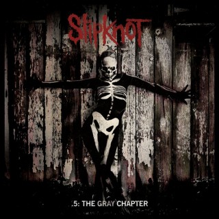
Image result for The Gray ChapterA more conventional piece of album artwork is from Slipknot's most recent album, 'The Gray Chapter'. It is named after the late band member Paul Gray who passed away in 2010. It features a skeletal figure with a rustic, wooden fence in the background. The image, gives of a unnerving feeling similar to that of Black Sabbath's album. It features the band name in their trademark font across the top with the album title across the bottom. It is clear from the album what genre of music to expect should you know nothing about the artist.


In conclusion, from my research I have gathered that my print product must be representative of the theme of the album but also eye catching in order to sell. Furthermore, links between the artist and the album help to brand the artist and increase sales even further.

Thursday, 1 December 2016

CD Digipak Template


To create the digipak for my CD I decided to create my own template before hand to make it easier when I create the final product. The above image is the template. I decided to create a tri-fold digipak which means there will be six panels (3 outside, 3 inside). The central panel will house the CD itself and the alternate side to that panel will be the back of the digipak. The 2nd page will then fold in on top of where the CD lies and the front page will fold onto the 2nd page. As well as this, I created a small template off to the side for art to put onto the actual CD.

Saturday, 26 November 2016

Contract of Employment

Due to creating a new music video, it meant that my actor/artist, Dan Greenway, had to sign another contract of employment due to the previous one being terminated as stated in it's terms due to the production being finished. Therefore he signed the same contract again to confirm that he will be working on this production as well.

Wednesday, 16 November 2016

Task 9 - Casting - Gone

For my production I only needed a single actor. This is to portray both the character in the narrative as well as the artist as they are meant to be the same person.

Therefore, I contacted a friend of mine who is doing A Levels in acting at Birmingham Ormiston Academy to see if they were interested and thankfully they were. This means I have successfully filled all possible roles and cast members for my production.

*Note: this is the same as the casting from the previous music video (King Of Anything) as only the narrative and song have changed. However, the narrative still only requires one person.

Tuesday, 15 November 2016

Task 8 - 'Gone' Music Video Final Proposal

I intend to create a music video for the song 'Gone' by Asking Alexandria. The title of the production will be as follows:

Dan Greenway - Gone

The channel best suited to broadcast this music video would be K! TV. This is because this is the TV channel for the radio station Kerrang! who owns multiple subsidiary radio channels. They are the biggest rock and metal broadcasters in Britain. It'd be something that they could broadcast at any time of the day as it is an easy going song.

The target audience for my song has already been discussed in my 'Task 4 - Target Audience - Gone' blog post but will quote it below nevertheless.

"Age: 15 - 25

Gender: Predominantly Male
Religion: Atheist
Ethnicity: Caucasian
Social Class: D/E

My target audience, according to the descriptors set out by Young and Rubicam, are strugglers. They are alienated from society and have limited skills away from physicality. A lot of their expenditure goes towards alcohol, junk food and music related clothing, by this I mean band t-shirts as stereotypically these kinds of people wear nothing but band shirts and wristbands. They will usually wear skinny, black jeans accompanied by shoes such as Vans and Nike. A lot of the time they will dye their hair black and the females in the audience will use make up to take on a pale complexion but they'll use exaggerated eye liner.

When looking at Mosaic's descriptors, the audience fits into the, O65 and O66 categories. A lot of the time they are young students, often going to university which can explain why they fit into the 'struggler' descriptor. These students who are struggling for money often have an issue with the world and take on more liberal views, and when it comes to elections they'll usually vote for Labour or the Liberal Democrats or not vote at all. As well as this, because of their lack of money they are extremely unlikely to vote for the Conservative party due to their austerity measures. When it comes to food, they'll be purchasing non-perishable food from places such as Aldi and Lidl due to how cheap it is, things like Pot Noodles and Super Noodles and tinned foods such as soups, baked beans and tinned hotdogs, however they wont even purchase 'Heinz' soups and beans they'll purchase the shops own brand. They will however spend more money on things like energy drinks than they can really afford, buying lots of Monster energy and Redbull. When they eat out it'll be at extremely cheap places such as weatherspoons that often offer 2 for 1 meal deals and their diet in general will not be very good, often eating fast food. They will also not have the money to go on expensive holidays, they're more likely to take up on one of the cheap holidays that the Sun newspaper offers. If they have a car it'll be second or even third hand and it will most likely be 2 door with atleast 60,000 miles on the clock. They will be using 'Daz' washing powder as it is cheap and other, higher end, products are out of their price range, or alternatively give their dirty washing to their parents to do.

My target audience, despite not being wealthy do have an income. They will inevitably receive a student loan will most likely work part time, this gives them a small amount of expendable income that they will use on such products as purchasing music. If my audience did not have this available expenditure then I would not target them with my music video as the long term goal is to convince them to purchase the music by my artist."

The video will be a combination of performance and narrative. It fits into it this category as it will tell a story whilst cutting sporadically to the artist singing the song at the same time. This will make it look professional as most music videos today are a combination of the two, this is to convey the meaning of the song to the audience whilst keeping them engaged with performance scenes.

*Note this is the same as my previous final proposal as it is a similar genre and style of song. As well as this, nothing logistically has changed. The changes that have been made are the song and narrative.

Monday, 14 November 2016

Creative Journey - Entry 8

In this instalment of my creative journey I will discuss:


  • Locations
  • Target Audience
  • Storyboarding
  • Role Allocation
Locations

I knew that I wanted to film in roughly the same locations as the previous music video. However, I knew that I wanted my location to be clearer and more representative of the narrative I was pursuing.

Target Audience

To research into my target audience I looked into Young and Rubicam, as well as Mosaic, to find information about people likely to fit into my audience. It revealed things such as what newspaper they're most likely to read, how old they are and what their social class is.

Storyboarding

After my last storyboard, I decided to hand draw it this time so they were clearer. It also meant I was not limited whatsoever in what I could put on it as I was drawing it, not using an online program.

Role Allocation

The role allocation for this production was identical to that of the previous music video as nothing had changed.

Sunday, 13 November 2016

Task 7 - Role Allocation

As I decided to take this project up on my own, and work without a group, I will take on every role involved in the production of my Music Video. This will entail me being a director, writer, camera person, editor and researcher, thus making me an 'Auteur'.

Auteurism:

An Auteur is someone who oversees so much of the production of a media product, they become the Author. Auteurism started in France during the late 1940s as one of many cinematic theories created by Andre Bazin and Alexander Astruc, later being called 'Auteur Theory' by american film critic Andrew Sarris.

*note: this is the same as the previous role allocation post as nothing has changed regarding roles from the previous production.

Saturday, 12 November 2016

Task 6 - Storyboard


Task 4 - Target Audience - Gone

Luckily, for my new music video the target audience remains the same. This is because the songs are relatively similar and come from similar artists. People who subscribe to this kind of music are very similar and the diversity within the fan base is minimal.

My target audience:

Age: 15 - 25
Gender: Predominantly Male
Religion: Atheist
Ethnicity: Caucasian
Social Class: D/E

My target audience, according to the descriptors set out by Young and Rubicam, are strugglers. They are alienated from society and have limited skills away from physicality. A lot of their expenditure goes towards alcohol, junk food and music related clothing, by this I mean band t-shirts as stereotypically these kinds of people wear nothing but band shirts and wristbands. They will usually wear skinny, black jeans accompanied by shoes such as Vans and Nike. A lot of the time they will dye their hair black and the females in the audience will use make up to take on a pale complexion but they'll use exaggerated eye liner.

When looking at Mosaic's descriptors, the audience fits into the, O65 and O66 categories. A lot of the time they are young students, often going to university which can explain why they fit into the 'struggler' descriptor. These students who are struggling for money often have an issue with the world and take on more liberal views, and when it comes to elections they'll usually vote for Labour or the Liberal Democrats or not vote at all. As well as this, because of their lack of money they are extremely unlikely to vote for the Conservative party due to their austerity measures. When it comes to food, they'll be purchasing non-perishable food from places such as Aldi and Lidl due to how cheap it is, things like Pot Noodles and Super Noodles and tinned foods such as soups, baked beans and tinned hotdogs, however they wont even purchase 'Heinz' soups and beans they'll purchase the shops own brand. They will however spend more money on things like energy drinks than they can really afford, buying lots of Monster energy and Redbull. When they eat out it'll be at extremely cheap places such as weatherspoons that often offer 2 for 1 meal deals and their diet in general will not be very good, often eating fast food. They will also not have the money to go on expensive holidays, they're more likely to take up on one of the cheap holidays that the Sun newspaper offers. If they have a car it'll be second or even third hand and it will most likely be 2 door with atleast 60,000 miles on the clock. They will be using 'Daz' washing powder as it is cheap and other, higher end, products are out of their price range, or alternatively give their dirty washing to their parents to do.

My target audience, despite not being wealthy do have an income. They will inevitably receive a student loan will most likely work part time, this gives them a small amount of expendable income that they will use on such products as purchasing music. If my audience did not have this available expenditure then I would not target them with my music video as the long term goal is to convince them to purchase the music by my artist.

Friday, 11 November 2016

Gone - Locations


Because my music video for Gone is based around suicide, depression and death I decided that it would be a perfect idea to open the video up with scenes from inside a church and it's graveyard outside. This, accompanied with the intro to the song, allows the audience to believe they know as to what is going to happen before the narrative even starts. As well as this, it draws them in with the impressive nature of the building.


Like the last music video, I will need to be filming inside the house of my actor. Therefore we will be using that location again as I still believe the location gives of distressing vibes which are essential for setting the scene to my music video. The whole narrative for this music video will be filmed inside the house as it features the artist having a breakdown and doesn't require him to go outside. The other factor that played into this decision was the lighting issues experienced in the first music video.