Wednesday, 18 January 2017

Evaluation Question 1. In what way does your media project use, develop or challenge forms and conventions of real media products?


SCRIPT

USE:
I used a range of shots throughout my music video. The narrative consists of a wider range of shots, including high angles, low angles, pans, zooms and over the shoulder shots to give more of a film like feeling. And my performance consists of close, medium and long shots including some angle shots to clearly display it as being a performance as defined by Richard Lester’s conventions set in the music video for ‘If I Fell’ by the Beatles.
I kept to Goodwin’s Media Theory that the pace of the music video should be complementary to the music accompanying it thus resulting in a slow paced music video with shot durations being longer than that of a typical pop video. Furthermore, I implemented this theory into the editing style with both cross fades and fades to black being longer than usual.
Another one of the conventions of a real media product I used was symbolism. I found symbolism is ripe in the music video industry through my research into existing music videos such as Formation by Beyonce, featuring symbolism of police brutality and references to Malcom X and Lady Gaga songs such as Bad Romance symbolizing the sexualisation of the industry. I decided to symbolize themes of death at the beginning of the video with multiple shots of a church and graveyard, and towards the end of the video with footage of a noose. Furthermore, I overlapped an image of an angel whilst the artist is looking to the sky but also incorporated shots of ‘fireball whiskey’ symbolizing an alcohol addiction. As well as this, the logo for the brand is an image of the devil which is the binary opposite of the angel as defined by Levi Strauss.
Another music video I researched was ‘Coming Down’ by Five Finger Death Punch. The song is about suicide awareness and explores many of the same themes. I used the basic narrative structure of this video within mine, showing the negative side before the positive side. In this music video, the protagonists are saved by a friend and a parent. My protagonist is saved by Samaritans Trust by talking to them on the phone after being told they can help by a friend. The phone number is featured in my music video similar to ‘Coming Down’ where it is featured at the end.

DEVELOP:
I developed Todorov’s narrative theory so that my music video started at the stage of disequilibrium rather than at a preexisting equilibrium. This was to thrust the audience directly into the music video, striking them with its topicality and thus hooking them early on.
I developed the narrative taking it away from its original meaning. It is actually about the best friend and guitar technician of the lead guitarist passing away. I reinterpreted it to refer to male suicide, almost like a suicide note mixed with the thoughts flowing through the protagonists mind. To reinforce this idea I included the writing of a ‘suicide note’ within the music video, featuring the song’s lyrics. I incorporated most of the things that stereotypically go along with suicidal thoughts, such as drug and alcohol abuse, but kept self-harm out of the music video as suicide and self-harm do not have to coincide with each other. Furthermore, instead of basing the narrative over a 24 hour period it is set over an indefinite period of time which is shown through the multiple costume changes and forms of lighting.

CHALLENGE:
I challenged the forms and conventions of real media products by using a vulnerable male protagonist, rather than a vulnerable female. This is because of the overshadowing topicality behind the video being that male suicide and depression is much higher because males don’t talk about their issues. The stigmas attached to the topicality are often portrayed as being emasculating. Therefore I believed it was correct to challenge the current products in the industry.
Furthermore, I negated the sexualized nature of the industry. I made sure my work consisted of entirely non-voyeuristic shots and my artist remained fully clothed in all but one shot which only revealed his shoulders and head. I did this because the industry, as seen through the works of Beyonce and Lady Gaga, is highly dominated by the corporations whom use sexualisation of both males and females to sell music. Furthermore, it would also be highly inappropriate to do it when the topic of the video is so sensitive, yet it has been done before in the industry as seen at the beginning of the music video for ‘Coming Down’. As well as this, in music videos were a male protagonist is portrayed is weak they are often ‘nerdy’, however in my music video I made sure my protagonist looked like an average, everyday man to challenge the stigma surrounding the topic.

In Conclusion, I have followed typical conventions of music videos but also took some of them further, developing them and other conventions I have done challenged completely, doing the opposite of what is the industry standard.

Saturday, 14 January 2017

Task 12: Audience Feedback

Feedback from Final Proposal/Pitch:

I received mostly positive feedback from my peers during this phase of the production, mainly for the story behind my music video being that of male suicide awareness as it is a topic rarely touched upon in music videos. However they were unsure as to how I would portray such a complex narrative in such a short time (in regards to the length of the song).

This lead to me to make changes to the story so it was clear from the beginning of the video what the overarching theme would be throughout the video by adding footage of a graveyard. Furthermore, it helped come to the decision to include the number for 'Samaritans' in my music video.

First Edit:

After watching my first edit, my peers told me that the narrative was still not 100% clear so I decided to add symbolic images to the video (noose, angel, drugs, alcohol, devil) upon editing it for the second time. This also adds another layer of depth to the music video and makes it appear more professional. As well as this, I should 'drain' the colour to add a darker feel to the music video.

Final Edit:

Upon watching my final edit, my peers informed me that I had successfully made the narrative clearer and that it looked like a professional production (when you take into account the limited equipment I had access too). They approved of the story line and the use of symbolism, as well as the phone number for 'Samaritans'.


The only negative criticism I received was that it was either:

a) not that persons music of choice
b) It would have been better if I had a longer song to develop the narrative even further due to it's abrupt ending.

Digipak:

The feedback I received for my digipak was almost entirely postive. My peers said that "it looked great" and that "it fits well with the music video".

I ensured that my digipak colour scheme was monochrome, clearly defining the genre and themes in the album it represents. The artwork included is also symbolic of the genre (inverted cross, scrawled text for the tracklisting).

One of my peers did raise the notion that being so dark, it would not attract as much attention when on the shelf. 

On the back of that criticism I edited it again, improving the colour scheme so that the artist, and his guitar, are in colour. The idea behind this being that the small use of colour on a largely dark canvas will draw attention as it is a focal point.

Magazine advert:


The feedback I received from my magazine advert was mostly positive, it had all the necessities that an advert needed and clearly shown my artist on it as well. It also included a picture of the album to make it easier for potential audiences to find it.

The only criticism raised was what the background of the image was, however they soon realised that it was actually the inverted cross from my digipak.

Thursday, 12 January 2017

Task 11: Print Artefacts - Magazine advert & Digipak


Below is an image of the digipak with the images not upside down. The reason they're upside down on the first image is to represent the way in which it would fold back on itself so the images would appear upright on the back of the digipak.


Thursday, 5 January 2017

Task 10 - Gone - Risk Assessment


Bibliography:

http://www.slideshare.net/KhemSlawson/risk-assessment-template-media-10512123

-I used this website to get a rough template for how to do my risk assessment.


Note: This is the same risk assessment as presented for the previous music video as the risks remain the same due to the similar nature of the video.


Project:
Gone
Name:
Owen Clive
Date:
16/10/16
 
 
Assistants
Dan Greenway
(actor)


What risks have been identified?
Potential injuries/damage
 
Severity 1,2 or 3
(3 being the worst)
Measures taken to prevent injury/damage
Number of people at risk
Moving Cars
3
 
Getting hit by a car could cause serious injury and trauma both directly to us, and indirectly to bystanders.
Always looking to cross the road before doing so and making sure to cross the road at a suitable place (crossing) rather than elsewhere.
 
Having a mobile phone to call an ambulance readily available.
2
Wet floor
2
 
A wet floor could result in it being slippy underfoot.
 
There could be mud which could ruin our clothes/costume.
To avoid injury we will wear suitable footwear for the terrain that we come across.
 
We will also take extra caution when walking up or down hills and on grass to avoid losing our footing.
 
To avoid ruining our clothing we will avoid mud where possible.
2
Stairs
2
 
We could fall up or downstairs, resulting in anything from minor bruising up to broken bones.
We will pay more attention when by stairs to avoid any potential injuries and not take part in any form of running/insensible activity around them.
2
Equipment
2
 
We could damage equipment by knocking it.
 
Equipment could get in the way, causing damage to us or the equipment.
To prevent equipment getting damaged we will handle it responsibly and not leave it lying around where it can stood on or kicked etc.
 
To prevent equipment getting in the way we will put it away at the first instance, instead of leaving it lying around. It will also not be placed in any locations where we will need to walk when not in use.
2
Wires
2
 
Wires pose a risk as they are a trip hazard. As well as this any damaged wires plugged into the mains could result in electrocution.
To not trip over wires they will all be taped down to the floor using tape.
 
We will also check all wires before use to make sure they are not damaged.
2
Cuts/grazes
1
 
Cuts and grazes are a minor risk because they are minor physical damage.
To prevent any cuts or grazes we will be sensible and not be silly with sharp objects.
 
If they occur we will treat them instantly (clean the wound and apply a plaster/bandage or if it is serious call an ambulance or go to the local minor injuries unit).
2
Getting hurt by props
1
 
The main prop is an electric guitar and if that hits one of us it could cause damage such as cuts/grazes or bruising.
To prevent being hit by the guitar we will behave sensibly with it, not swinging it around and carrying it properly at all times.
2
Weather
1
 
The weather contributes to other risks more than being a risk in itself. It contributes to the wet floor, damage of equipment, damage of wire and pretty much most of the risks presented.
To avoid/prevent injury surrounding the weather, we will only film outside when the weather is suitable and not when it is heavily raining or windy etc.
2


Tuesday, 3 January 2017

Creative Journey - Entry 9

In this entry, I will discuss:


  • My Final Proposal
  • Casting
  • Contract of employment
  • CD Digipak Template
  • Print artefact research
Final Proposal

During my final proposal I pitched my idea to my peers in class accompanied by handouts and the song in the background. They gave me valuable insight into the pros and cons of my video.

Casting

Casting was very simple as I am still working with the same actor and still have a single character narrative.

Contract of Employment

To try and create a professional environment, I created a contract for my artist/actor to sign as if it was a real music video.

CD Digipak Template

To help myself later on, I created a template for my digipak on PhotoShop after finding out the measurements for its height and width as well as 'bleed' areas for the ink.

Print Artefact Research

To create effective and professional looking print products, it was necessary to research existing ones. I looked in depth into the artist Storm Thorgerson for inspiration.

Thursday, 8 December 2016

CD Print Artefact Research

Image result for storm thorgerson
Storm Elvis Thorgeson was an English graphic designer and music video director. He is best known for his works for Pink Floyd, Biffy Clyro, Black Sabbath and many other famous rock bands. He founded a company called Hipgnosis, a London based art design group who specialised in the production of album artwork. He later worked for his own company, Storm Studios founded in the early 1990's.


Image result for biffy clyro puzzleThorgeson's is a prime example of someone a band goes to, to get excellent album print work to take them from a small, unknown artist to one of success. The best example of this being Biffy Clyro, who started as an obscure indie band from Kilmarnock, Scotland. They used Thorgeson's abstract art work to help propel them into the mainstream due to it's eye catching nature. The artwork he has created for them has helped to create an image for the band. For example, the art work for the album 'Puzzles shows a man made out of puzzle pieces with one missing, the three members of the band then had that missing puzzle piece tattooed onto themselves in the same spot thus helping to create their image.
Image result for black sabbath black sabbath

Another famous artist was Keith MacMillan, or 'Marcus Keef' as he became known. He was responsible for many album and vinyl covers belonging to unheard of underground experimental/metal bands. He worked for Phonogram Record Company, a subsidiary of Phillips. His most famous work was the debut album Black Sabbath by Black Sabbath which sold out without any advertisement whatsoever due to the artwork. It featured a dark, ghostly figure staring back at the audience.

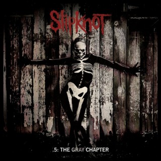
Image result for The Gray ChapterA more conventional piece of album artwork is from Slipknot's most recent album, 'The Gray Chapter'. It is named after the late band member Paul Gray who passed away in 2010. It features a skeletal figure with a rustic, wooden fence in the background. The image, gives of a unnerving feeling similar to that of Black Sabbath's album. It features the band name in their trademark font across the top with the album title across the bottom. It is clear from the album what genre of music to expect should you know nothing about the artist.


In conclusion, from my research I have gathered that my print product must be representative of the theme of the album but also eye catching in order to sell. Furthermore, links between the artist and the album help to brand the artist and increase sales even further.

Thursday, 1 December 2016

CD Digipak Template


To create the digipak for my CD I decided to create my own template before hand to make it easier when I create the final product. The above image is the template. I decided to create a tri-fold digipak which means there will be six panels (3 outside, 3 inside). The central panel will house the CD itself and the alternate side to that panel will be the back of the digipak. The 2nd page will then fold in on top of where the CD lies and the front page will fold onto the 2nd page. As well as this, I created a small template off to the side for art to put onto the actual CD.