
Storm Elvis Thorgeson was an English graphic designer and music video director. He is best known for his works for Pink Floyd, Biffy Clyro, Black Sabbath and many other famous rock bands. He founded a company called Hipgnosis, a London based art design group who specialised in the production of album artwork. He later worked for his own company, Storm Studios founded in the early 1990's.
 Thorgeson's is a prime example of someone a band goes to, to get excellent album print work to take them from a small, unknown artist to one of success. The best example of this being Biffy Clyro, who started as an obscure indie band from Kilmarnock, Scotland. They used Thorgeson's abstract art work to help propel them into the mainstream due to it's eye catching nature. The artwork he has created for them has helped to create an image for the band. For example, the art work for the album 'Puzzles shows a man made out of puzzle pieces with one missing, the three members of the band then had that missing puzzle piece tattooed onto themselves in the same spot thus helping to create their image.
 :format(jpeg):mode_rgb():quality(40)/discogs-images/R-462466-1464284643-3601.jpeg.jpg)
Another famous artist was Keith MacMillan, or 'Marcus Keef' as he became known. He was responsible for many album and vinyl covers belonging to unheard of underground experimental/metal bands. He worked for Phonogram Record Company, a subsidiary of Phillips. His most famous work was the debut album Black Sabbath by Black Sabbath which sold out without any advertisement whatsoever due to the artwork. It featured a dark, ghostly figure staring back at the audience.
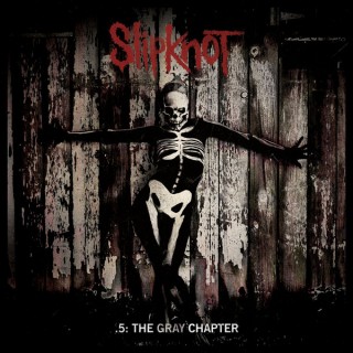 A more conventional piece of album artwork is from Slipknot's most recent album, 'The Gray Chapter'. It is named after the late band member Paul Gray who passed away in 2010. It features a skeletal figure with a rustic, wooden fence in the background. The image, gives of a unnerving feeling similar to that of Black Sabbath's album. It features the band name in their trademark font across the top with the album title across the bottom. It is clear from the album what genre of music to expect should you know nothing about the artist.
In conclusion, from my research I have gathered that my print product must be representative of the theme of the album but also eye catching in order to sell. Furthermore, links between the artist and the album help to brand the artist and increase sales even further.
